UX
This is the page description.
— UX —
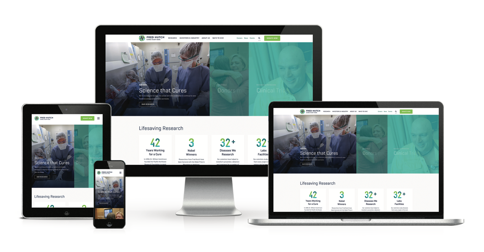
While MY PRODUCT STRATEGY SKILLS wERE honed at Expedia (prioritization, iterative testing, DATa analysis), they were fully-realized at FRED Hutch, a non-profit cancer research institute.
FRED HUTCH / DIGITAL
The responsive redesign of the Hutch’s primary website had to engage four distinct user groups (clinical trial patients/volunteers, donors, scientific peers, job-seekers) across a 10,000-page site and involve more than 80 unique (and highly-invested) stakeholders. We needed a strategy for this effort that allowed us to simultaneously erase significant tech/content debt, upgrade search functionality, convert SEO/Social traffic and create an entirely new responsive design system and component library on the AEM platform. As the platform Product owners, we also had to support a new code based, training process and authoring UI for 500 internal users. To help ensure the project’s success, we tested multiple prototypes to ensure our guiding UX/Design principles were solid and we could confidently deliver revenue, recruiting and brand awareness goals.
The site launched July 1, 2019 and the results suggested that our approach was successful:
Q4 2019 SITE TRAFFIC +55% / MOBILE +164% / NEWS CONTENT +127% / RECRUITING +37% / DONATIONS +20%
YOY DONATIONS +163% / USERS +111% / SESSIONS +88% / PAGEVIEWS +53% / TIME ON PAGE +29% / ORGANIC BOUNCE RATE -37%
The redesign proved to be an even bigger driver of engagement the following year. We were able to create new sections/pages quickly (several hours vs. many days) — speed that we needed when COVID-19 focused global eyes on the Hutch’s infectious disease research. Thanks to our SEO and mobile AMP implementation as well as the flexibility of our component stack, site traffic surged and we capitalized on that spike by cross-linking pages with fundraising content.
Q1 2020 SITE TRAFFIC 1.2million / NEW USERS 870k / NEW DONORs +58%
Another big win from the redesign was introducing a new interactive campus map which provided detailed information about the 15-acre campus, buildings, staff, parking, etc. User feedback (both internal and external) was surprisingly effusive — perhaps in part to the old map being outdated and impossible to use on a mobile phone.
[FRED HUTCH DIGITAL PROPERTIES PRIOR TO REBRAND AND LEADING INTO REDESIGN: FREDHUTCH.ORG, CENTERNET (CAMPUS INTRANET), LAB WEBSITE]
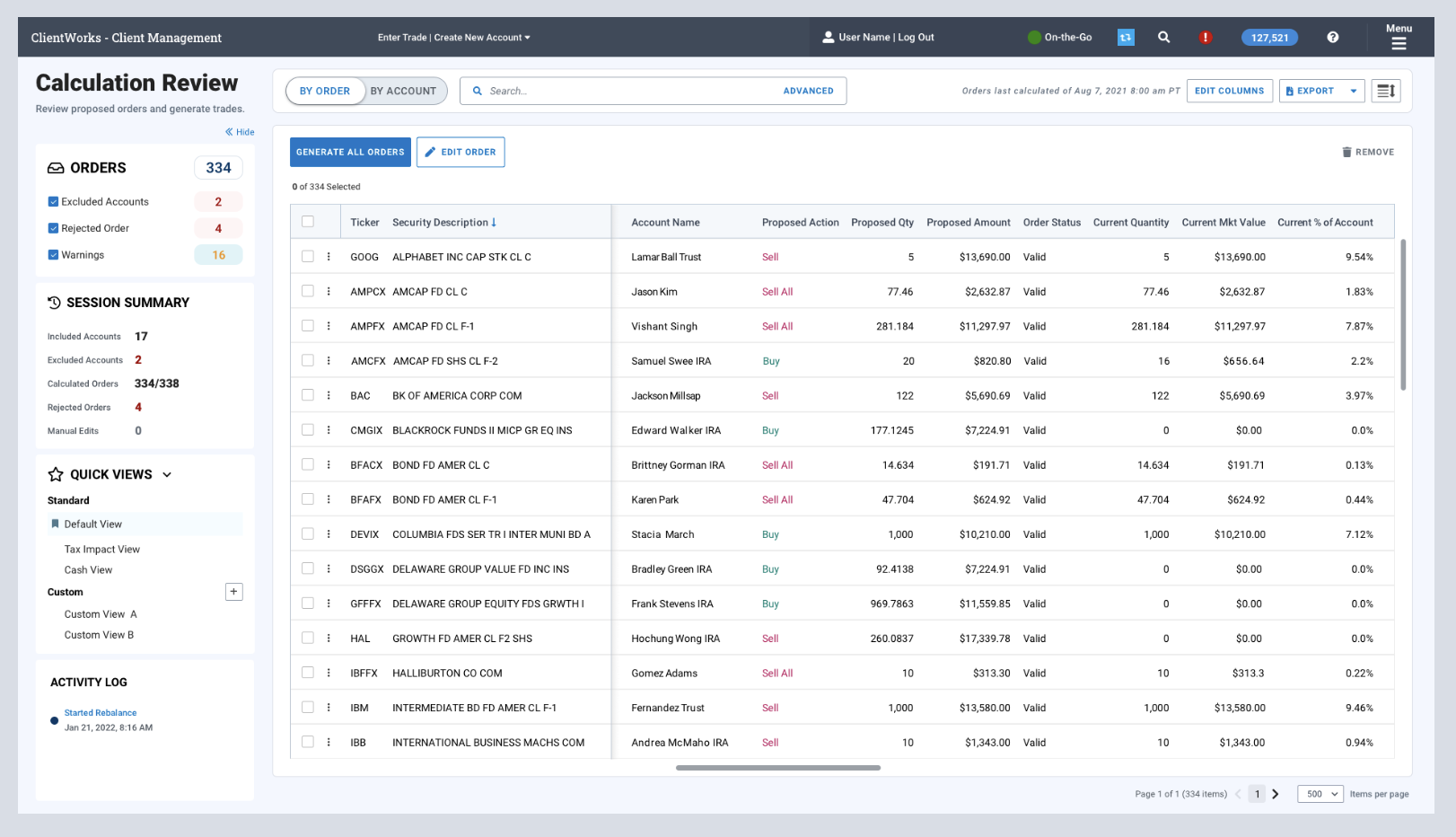
LPL FINANCIAL / PX
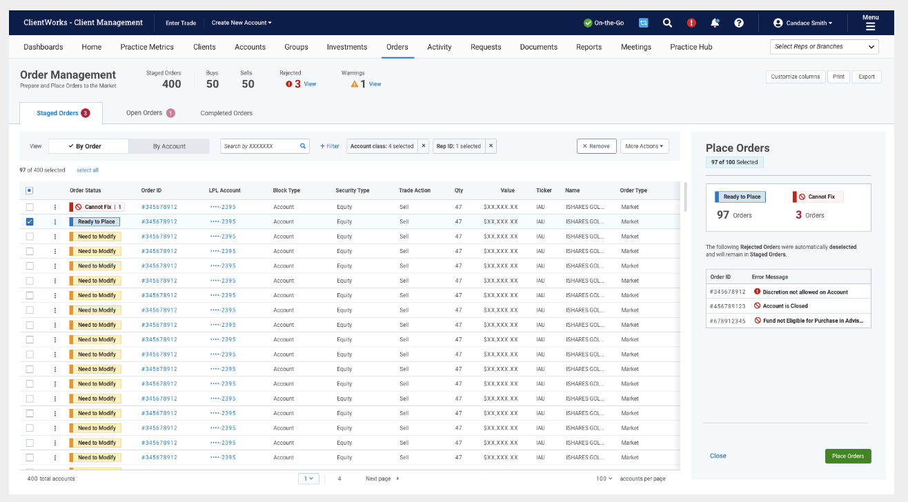
Since joining the company in January 2021, I’ve applied the same principles at LPL Financial — a fintech company providing a suite of planning, trading, banking & lending tools and services to independent broker-dealers.
[LEGACY TRADING ORDER MANAGEMENT UI]
EXPEDIA’s B2B APP
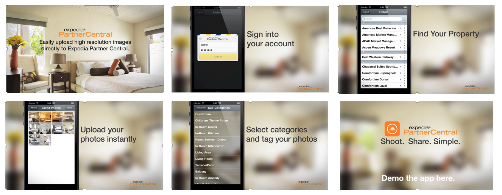
While working on B2C projects at Expedia, I kept hearing about a huge pain point for hoteliers unable to get more (and higher-res) photos of their properties onto their sites. All data pointed to stronger conversion with more images, but hotels seemed unable to close the gap. Couldn’t we make it easy for them by creating a B2B iPhone app — where they shoot and upload high-quality photos in a few steps? In hindsight, both the observation and the solution seem obvious…but I was literally the person who came up with the idea, lead the development project and helped market it with customers (App Store and Las Vegas conference). And we designed/built/released it for US-based hotels in less than four months.


